Wondr Medical, 2020 · 12 min read
Overview
Wondr Medical is a platform that helps doctors and medical professionals globally collaborate, connect, and advance medical knowledge, aiming to build the world's most connected medical network.
As the first UX product designer, I took the lead on important research and design projects across the company, including this discovery project that was, at the time, highly critical to the business.
Key takeaways
The Challenge
PROBLEM STATEMENT
The business struggled with low user retention, driven by a poor understanding of physician needs and a self-referential, underdeveloped UX. As a result, 30-day retention rates fell below 2%.
Kick-off: Identifying and addressing core product challenges
When I joined Wondr, the business aimed to evolve its core offering from hosting medical educational videos to creating a video conferencing and social media platform for medical professionals.
As UX lead, I encountered a product facing significant challenges, primarily rooted in a lack of user engagement. These challenges were interconnected, compounding product debt and limiting our ability to build and learn iteratively.
Discussions with the team and senior leadership confirmed that this disconnect from users not only weakened our understanding of their needs but also made it difficult for the product to meet their expectations effectively. We broke it down accordingly:
User knowledge:
The company lacked a strong understanding of UX, leading to products based on assumptions rather than real user needs. This gap in user knowledge resulted in features that didn’t resonate with our audience.Product debt:
The lack of user insights contributed to product debt, with features built that didn’t solve real user problems. The focus on rapid feature development without alignment to user needs led to a fragmented product experience, requiring costly rework.Testing and learning:
The rush to release features quickly also led to technical debt, as speed was prioritized over quality, leaving little room for iterative testing and learning.
Strategy
Implementing user-centered tactics to improve retention and growth
After deciding to focus on increasing 30-day user retention, we as a team set a target of 20%. This represents a significant improvement from our current 2%, though it still falls short of the 33% benchmark for technology apps.
With senior management's approval, I led a discovery team in collaboration with the product director, VP of engineering, and senior product designer. We aligned our expertise to maximize effectiveness.
My role focused on guiding the team through the discovery process, which largely meant introducing new concepts to the team, such as the opportunity solution tree, story and assumption mapping and experimentation methods; this was alongside conducting user interviews, creating discussion guides, synthesising insights, and translating them into actionable design strategies.
We propritised three core strategies, each supported by the following initiatives.
Our objective:
Increase 30-day user retention by approximately 20%.Build and learn from our community:
Engage our community of physicians to create open channels of communication, gathering insights into their real-world needs to inform product decisions.Give the user a seat at the table:
Deepen our understanding of user behavior, preferences, and needs by integrating user feedback into the product design process, ensuring our solutions are aligned with user expectations.Synthesis:
Systematically being able to track and articulate user learnings and challenges to the organisation, facilitating informed decision-making that supports retention goals.
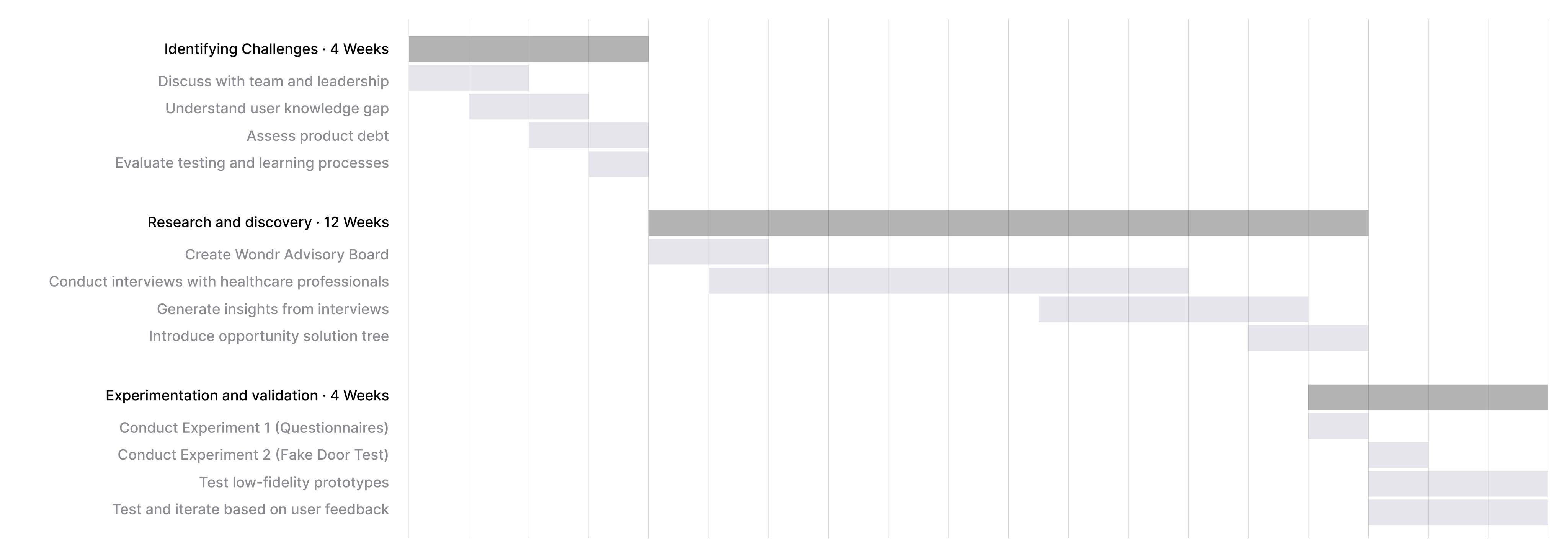
The timeline below outlines our strategic approach to executing these core strategies, emphasising the key phases and decisions we made to tackle user challenges, conduct in-depth research, and iteratively validate our solutions.
Discovery and Research
Leading the team and leveraging the power of user research and rapid validation
We initiated generative research to capture real-world insights from healthcare professionals and key opinion leaders (KOLs), who are often pressed for time and challenging to engage. We explored their pain points and needs through in-depth interviews. All enabled by:
Inviting a 10,000-physician mailing list and friends of the company to join our "Wondr Advisory Board".
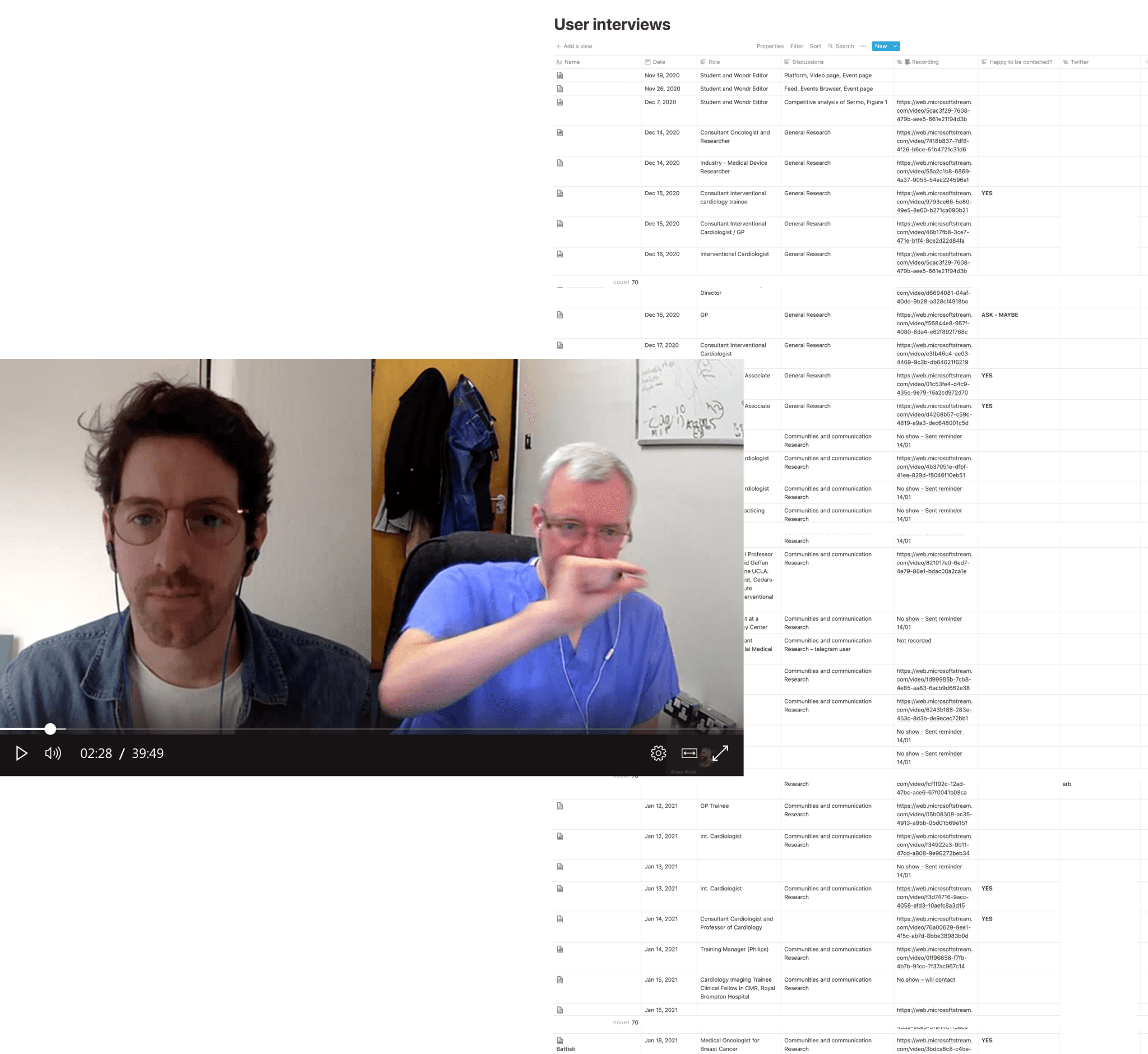
Nurturing our mailing list and newly subscribed advisory board community led us to conduct interviews with 50 healthcare professionals and 20 KOLs globally.
Introducing low-fidelity prototypes to quickly validate hypotheses and add context as our knowledge base grew
Rigorously testing our assumptions to ensure our solutions were rooted in real user needs and behaviours, effectively reducing risks and significantly enhanced our collective understanding of the process.
*KOLs are recognised for their expertise, research contributions, and their ability to influence the practices and opinions of other healthcare providers, often shaping treatment guidelines and medical innovation.
PROJECT FEEDBACK
Patterns emerged from insights
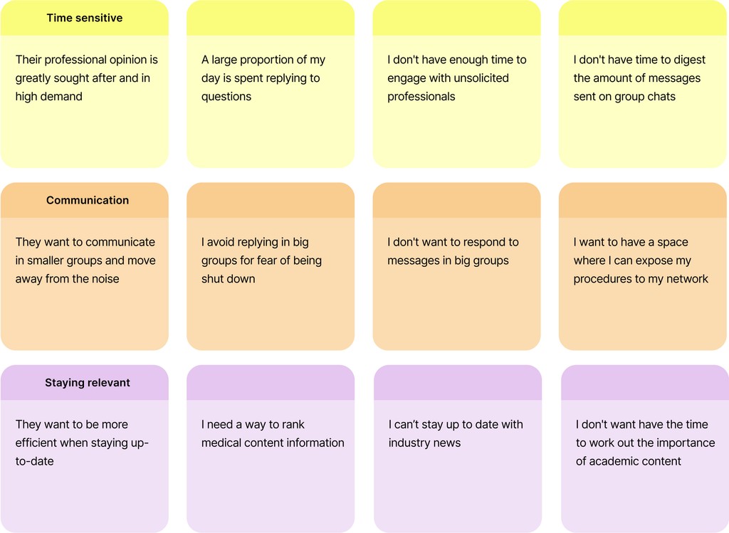
Speaking to users allowed us to capture and isolate insights as needs, desires, wants, or pain points expressed during the interviews. By clustering these insights, we were able to frame the broader problem more effectively.
Leveraging the continuous discovery framework, we maintained a cadence of regular experimentation and solution development, iterating on past learnings while simultaneously exploring new opportunities.
Making sense of it all with the opportunity solution tree
The opportunity solution tree is a visual aid that helps track research insights clearly while keeping our focus on a desired outcome.
I first used the opportunity solution tree in 2019 during Teresa Torres’ 6-week ‘Continuous Discovery Habits’ mentoring program.
Solutionising and story mapping
We started by story mapping our solutions, which quickly aligned the team around a clear understanding of the user journey. This method allowed us to visualise the entire experience, uncovering risks, pitfalls, and gaps in our thinking.
We then rigorously tested our assumptions to ensure our solutions were rooted in real user needs and behaviours. This approach effectively reduced risks and significantly enhanced the quality of the user experience.
Exploring diverse validation strategies: from questionnaires to fake door tests
To better understand user needs and validate our research, we distributed a questionnaire via Maze (Experiment 1) to medical professionals recruited through our product advisory board. Physicians specified their level and specialty, then ranked proposed features, based on insights we’d gathered, that they found most useful. This gave us a direction and evidence based learning, as to what features we should use for our fake door test experiment.
Our fake door test (Experiment 2) gave us a true insight as to whether doctors expressed interesed in our proposed app idea. Using Facebook ads we were able to target physicians with our (at the time fake) Wondr Medical app. Users were directed to a marketing page promoting the app, where they could initiate a download to their preferred native platform; Android or iOS. This experiment allowed us to gauge the appetite for our app solution in the real world, away from labs, video calls and testing environments. The app was downloaded 150 times in 5 days.
Honing in on the product idea
Further rounds of user testing allowed us to present and learn about various iterations of the product idea, narrowing and shifting our focus towards ‘groups and communities,’ particularly around second opinions and secure sharing of case or patient information. Uncovering key and industry leading findings giving us visibility to gaps and user needs underserved or not currently solved commercially.
During this phase, we presented another round of screens and low-fidelity prototypes to gather feedback. Our goal of creating a product that enhances retention came closer to fruition as we focused on enabling physicians to communicate easily and securely in smaller groups, collaborate effectively, and ultimately advance medical discovery—all in service of the customer’s needs.
User testing for concept validation and feature clarity
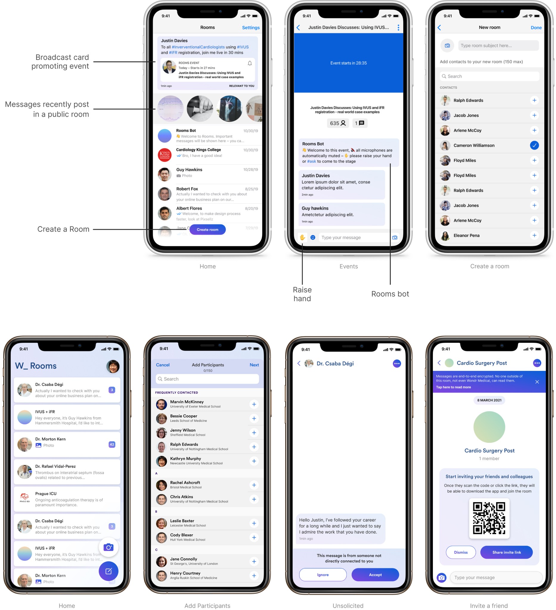
Below are some of the prototype screens we presented to users to gauge their understanding of feature ideas, gather feedback on the overall concept, and assess product comprehension.
Various screens for testing scenarios
The outcome
Product launch video from CMO
Various UI components


